Onyx Gold
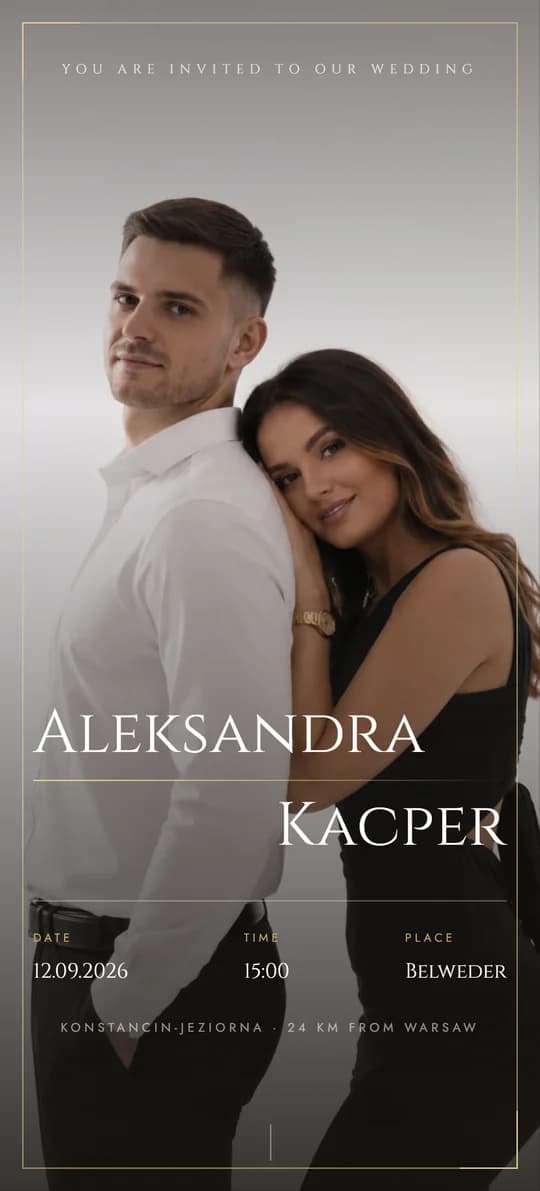
Black, Paper and Gold, Full of Glamour
Palace Splendour
09 / 11
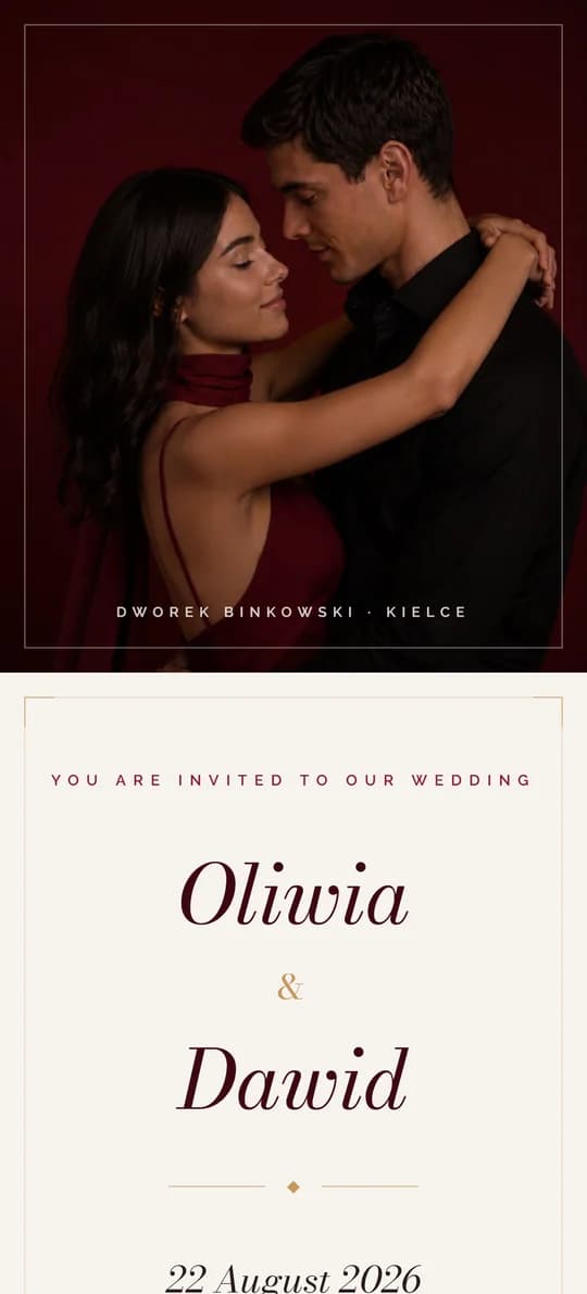
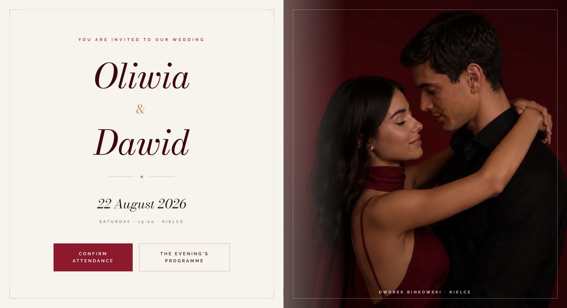
Burgundy Class and Gold Details
Rich burgundy, light cream and antique gold create an elegant, evening mood inspired by classic ballrooms.
About the theme
Crimson-Cream is a theme for couples who want to pair romance with refinement. Deep shades of red and burgundy build the atmosphere of a special occasion, and gold accents add prestige throughout.
It suits palace and classic weddings beautifully, and inside it has everything you need: RSVP, a direction map, a gallery and a shared song list.
A guest opens the invitation midweek and gets a preview of an evening nothing like their day. That's the one job it has to do here.
Who it suits
It's a good fit if
Consider another theme if
Colours and fonts
Cream
#F7F3EE
Background for the page. A warm base that keeps the burgundy from feeling heavy.
Burgundy
#8B1A2B
Velvet panels and headings. The colour that gives the whole page its evening tone.
Antique Gold
#C9975A
Finely worked frames and lines. Matte, in the spirit of an old stage rather than glitter.
Dark Brown
#2A1A1A
Body copy. Warmer than black, so it holds the palette even over longer paragraphs.
Headings
Bodoni Moda
Bodoni Moda reads like type stamped on a theatre poster - bold and formal.
Body text
Raleway
Raleway is light and neutral, so the text never competes with the decorative headings.
What's included
Standard package
You get all 24 things on this list in every one of the 11 themes - for a one-off PLN 300, with your own domain and hosting for a year. Choosing a theme is choosing a look, not a scope. The demo shows only some of them - a site with everything at once would be too long to browse comfortably. We put yours together from what you actually need.
And more Room for extra sections and information from you.
Guests from abroad read it in English
Every theme comes with a complete English version at the same price. There is a switch in the corner of the page: one tap and the invitation, the RSVP, the running order and the map are all in English. You send everyone the same link and each guest sees it in their own language.
What you see in this demo
08 items
This is a slice, chosen so the demo can be browsed in a few minutes. Everything on the list above can be switched on in this theme too.
Guide
A rich burgundy, light cream and antique gold - a combination that calls to mind a ballroom, a heavy curtain, dinner by candlelight. The first screen looks like a theatre poster, and the finely worked gold frames return later in the menu card and the gallery. At a reception in a palace, a manor house or a classic high-ceilinged room, the invitation sets the tone for the occasion straight away. A guest opening it at work midweek starts looking forward to it long before the date arrives - which is the one thing an invitation can really do before the wedding itself.
The order of the evening reads like a playbill: welcome with champagne, the first dance, the cake, the dancing. Named moments instead of formal labels mean a guest actually reads the programme instead of skimming past it, and knows what time it's worth being in the room. Dinner time and the moment the dancing starts are marked clearly, since everyone plans their evening and their journey home around them - which means nobody leaves fifteen minutes before the best part. If you're planning a surprise, the programme can hint at it without giving it away.
A venue with history is an argument in itself, so it's a shame to leave it at just an address. Two lines about the building - when it was built, what a guest sees on walking in - build anticipation better than a gallery of interior shots. Next to it sits the practical part, which usually catches people out at venues like these: the entrance can differ from what sat-nav shows, parking is often limited, and the gate closes at a set time. If the venue has rooms, that's also where a booking note under your name goes - for some guests, that's the detail that decides whether they stay until the end of the dancing.
Other themes
See the full collection →Black, Paper and Gold, Full of Glamour
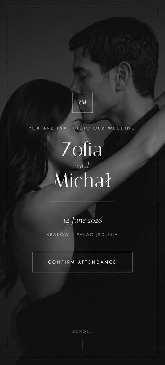
Black and White, Styled Like a Magazine
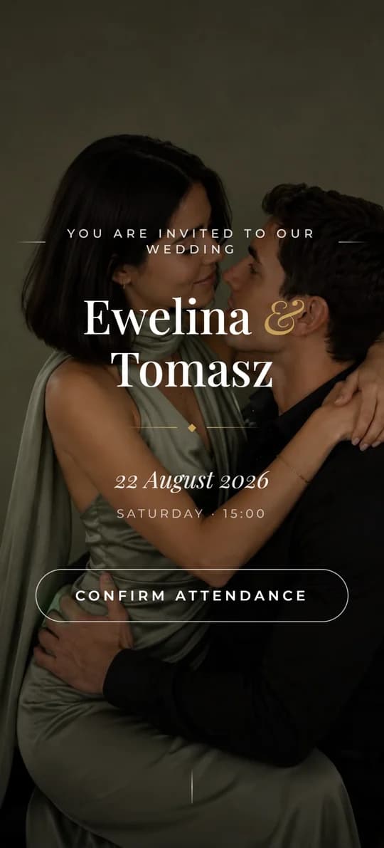
Warm Harmony and Rustic Elegance
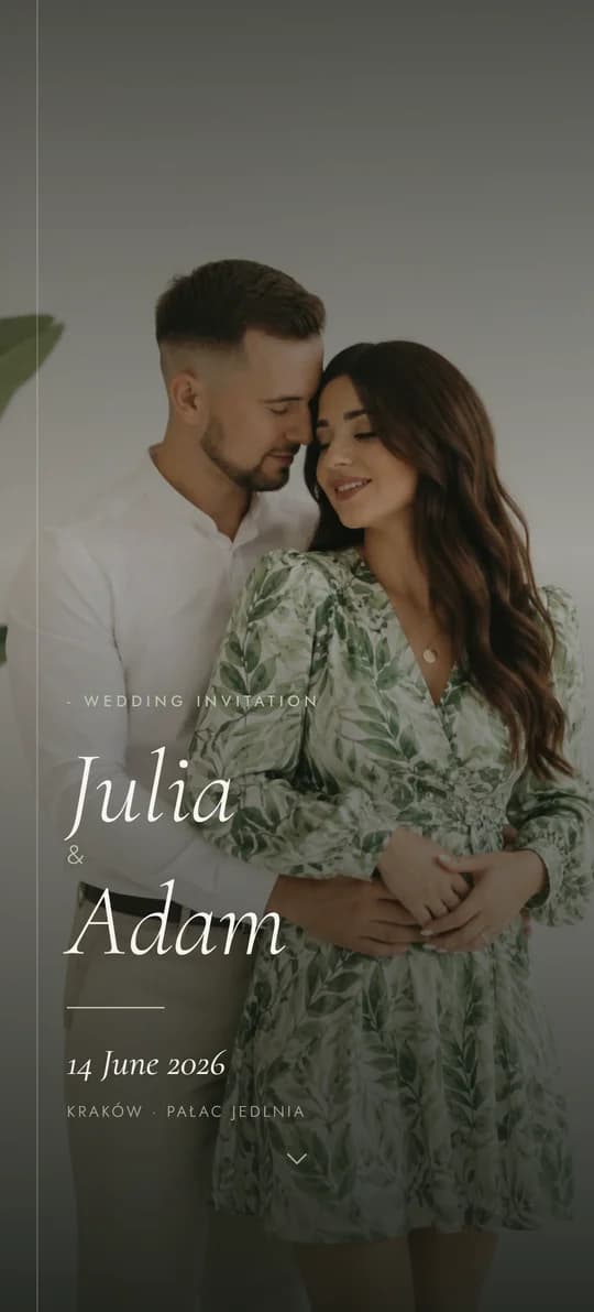
Botanical Freshness and Quiet Order
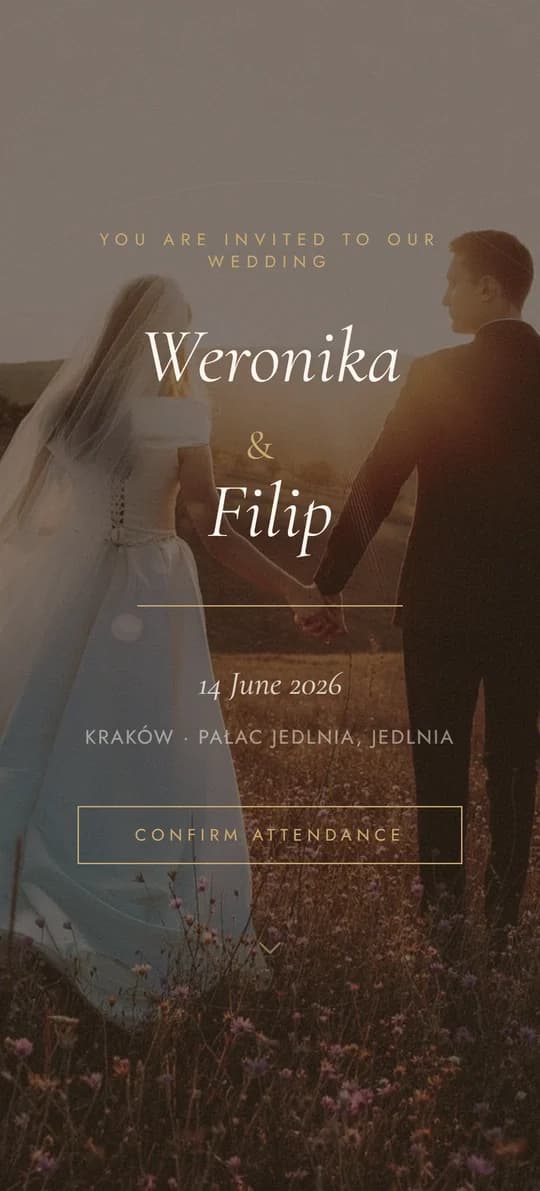
Classic Elegance, Reimagined
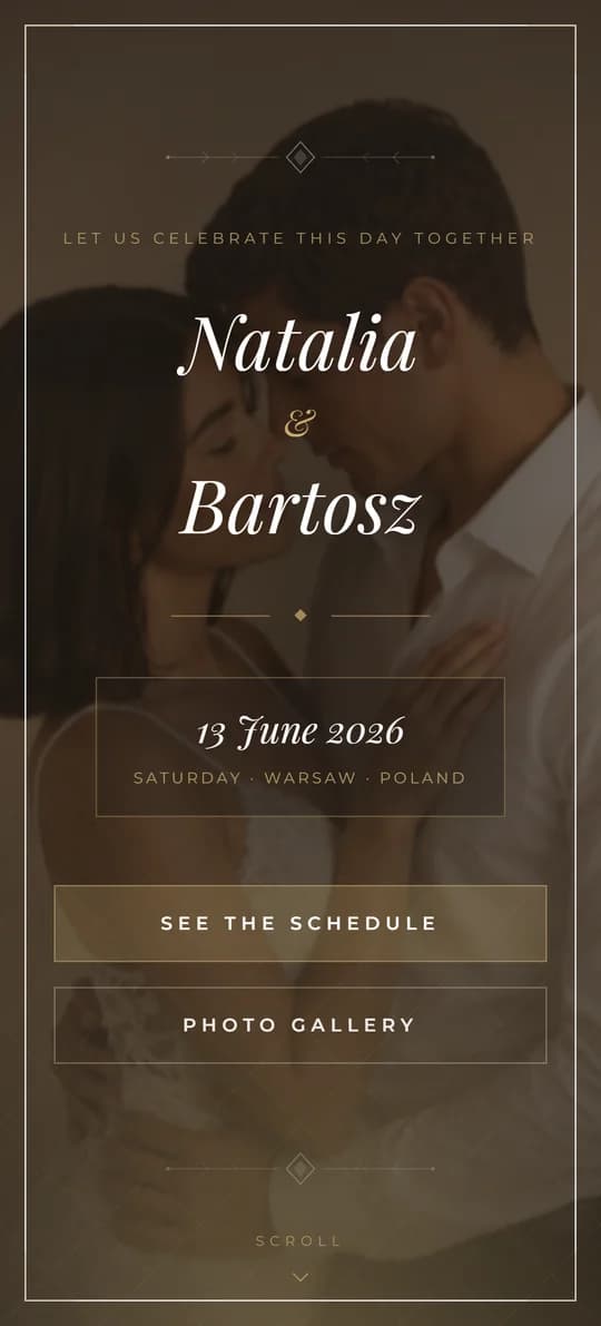
Cinematic Elegance in Warm Tones
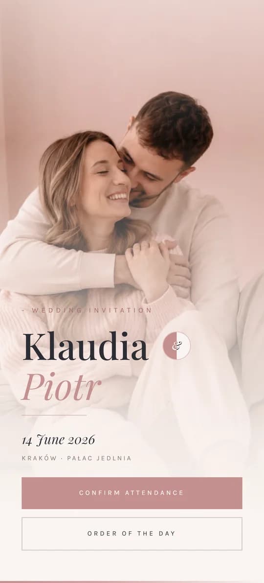
Romantic Softness in Morning Light
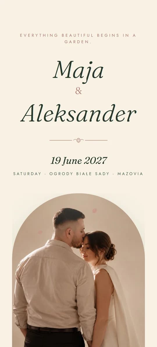
An Invitation in an Envelope, Sealed with Wax
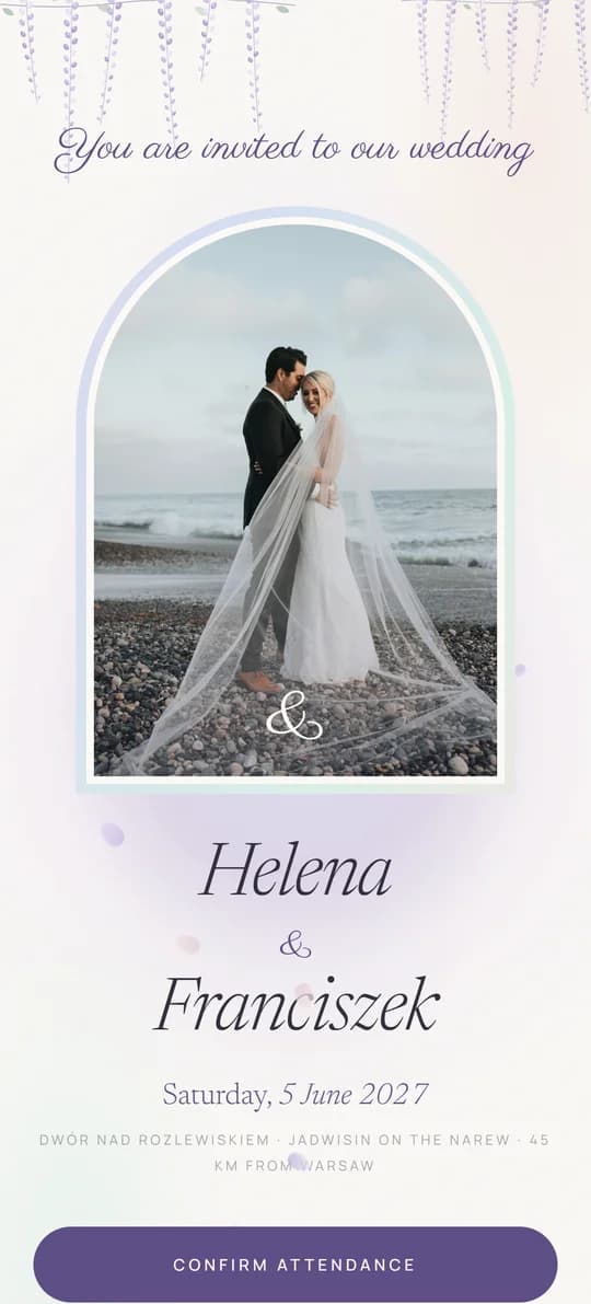
Pearl, Mist and Wisteria - with a Seating Plan
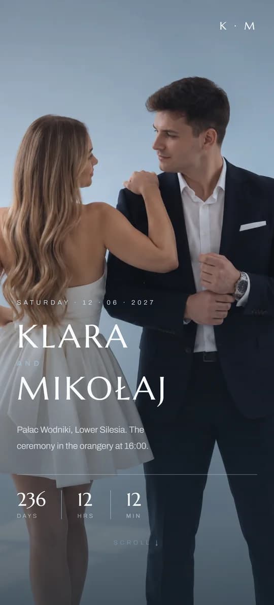
A Silk Ribbon and Cool Blues