Onyx Gold
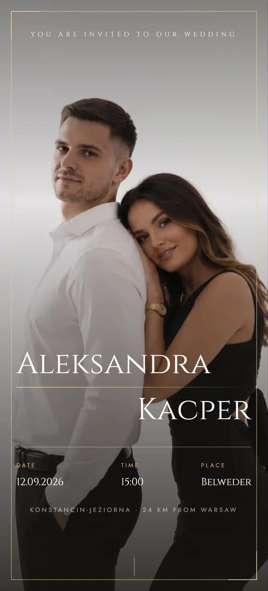
Black, Paper and Gold, Full of Glamour
Green and Simple
04 / 11
Botanical Freshness and Quiet Order
Simplicity borrowed from nature. Sage green and paper white bring a light, fresh mood - just right for a garden wedding or one in an orangery.
About the theme
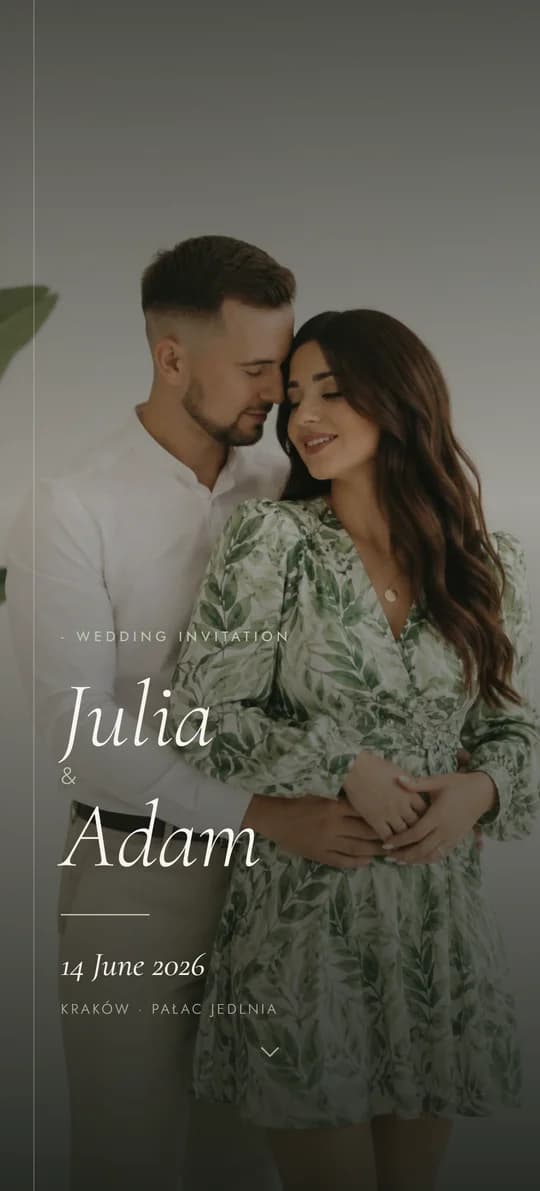
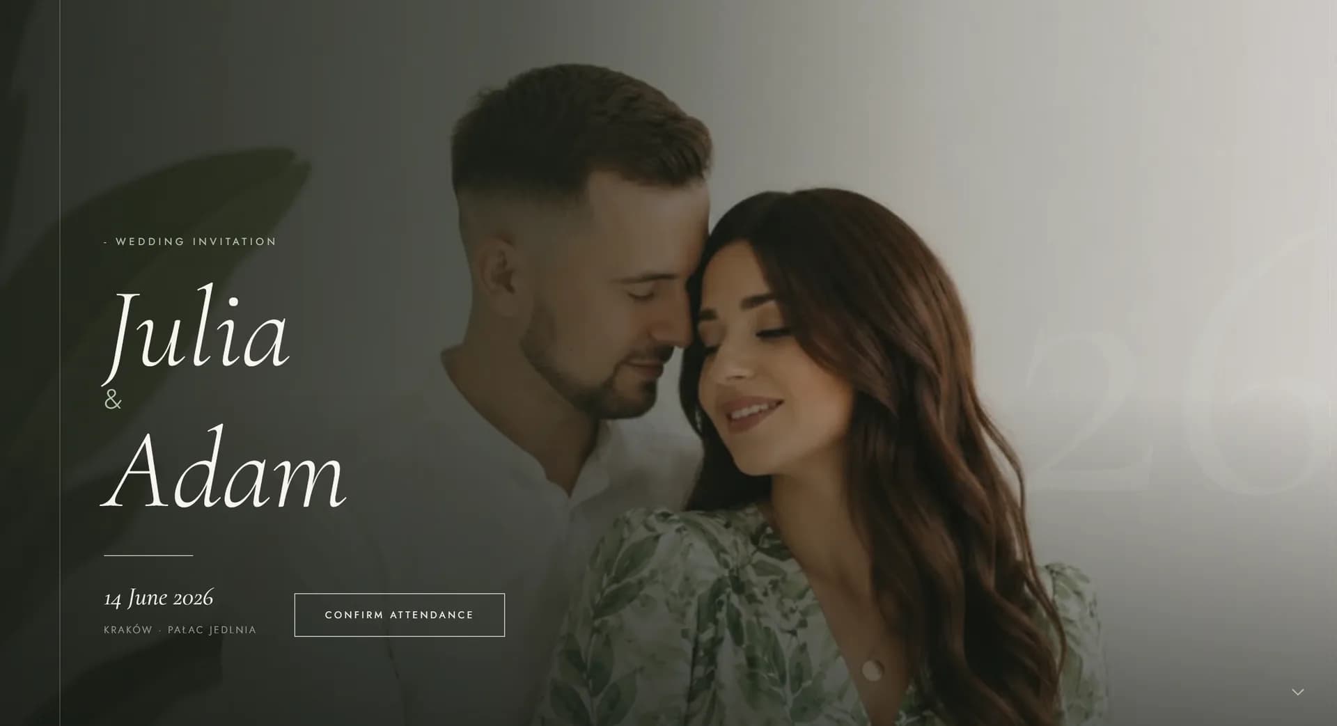
GreenWhite is a breath of fresh air among wedding invitations. It opens with a full-screen photo of you two, toned down into green and paper white, then settles into a calm, two-column rhythm: a label on the left, content on the right. Cormorant Garamond sets the headings in italics, and dates and captions line up in a neat column, one under the other.
Along the way, guests pass through an Our Story section, a countdown, the day's schedule, a menu card, direction maps, RSVP, a song request playlist and a shared gallery, with a shortcut bar pinned to the bottom of the screen on phones. The phone version and the computer version are each designed on their own, not stretched from one to the other. A choice for couples who love a handmade feel, calm, and closeness to nature.
The same two-column rhythm returns in every section, so by the second screen a guest stops searching and starts reading.
Who it suits
It's a good fit if
Consider another theme if
Colours and fonts
Paper White
#f7f4ef
Background with a barely-there texture - closer to a sheet of paper than a screen.
Sage
#7a8c6e
Labels, lines and botanical accents. A muted green, never garish.
Dark Green
#3d4a36
Buttons and sections meant to hold the eye - the darkest point in the palette.
Graphite
#2a2a25
Body copy. Dark, but not black, so it never clashes with the green.
Headings
Cormorant Garamond
Cormorant Garamond sets headings in italics - soft, in the spirit of a well-set book.
Body text
DM Mono
DM Mono lines dates and times up in a neat column, so the schedule reads in one glance.
What's included
Standard package
You get all 24 things on this list in every one of the 11 themes - for a one-off PLN 300, with your own domain and hosting for a year. Choosing a theme is choosing a look, not a scope. The demo shows only some of them - a site with everything at once would be too long to browse comfortably. We put yours together from what you actually need.
And more Room for extra sections and information from you.
Guests from abroad read it in English
Every theme comes with a complete English version at the same price. There is a switch in the corner of the page: one tap and the invitation, the RSVP, the running order and the map are all in English. You send everyone the same link and each guest sees it in their own language.
What you see in this demo
11 items
This is a slice, chosen so the demo can be browsed in a few minutes. Everything on the list above can be switched on in this theme too.
Guide
Sage green and paper white are the colours of a garden on a September afternoon - fresh, cool, unburdened. The page opens with a full-screen photo of the two of you, toned down into those two shades, and everything after settles into a calm rhythm. For an outdoor wedding, a reception in an orangery or a garden, the invitation promises exactly the day guests will see in person, so the decorations and the page read as one considered project rather than two separate decisions. That's the difference you can spot in the wedding photos afterwards.
A short label on the left, content on the right - and that same layout returns in every section. By the second screen a guest stops searching and simply reads, which means they reach RSVP instead of dropping off halfway through. Dates and times line up in a neat column, one under the other, and you can see the gaps between the points of the day. Even the directions, the schedule and the menu end up looking designed, not tacked on at the end. The phone version is designed on its own, not squeezed down from the computer one - and most of your guests will open the page on a phone.
The Our Story section is the one place where the page speaks in your own voice: a handful of dates, one line at each - when you first met, a trip together, the proposal. Guests read this section more than any other, because they learn something they didn't know, and along the way they scroll through the rest of the page and reach the form. Four to six points are enough. Two photos across the whole section make a stronger impression than a full set, because they leave room around the text. This section arrives ready to fill in - just send the words.
Other themes
See the full collection →Black, Paper and Gold, Full of Glamour
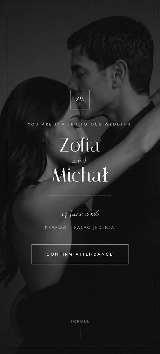
Black and White, Styled Like a Magazine
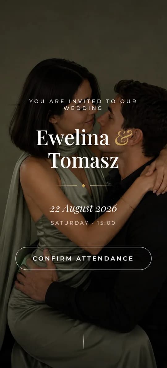
Warm Harmony and Rustic Elegance
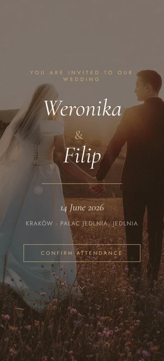
Classic Elegance, Reimagined
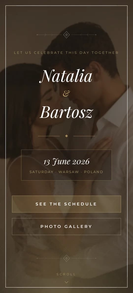
Cinematic Elegance in Warm Tones
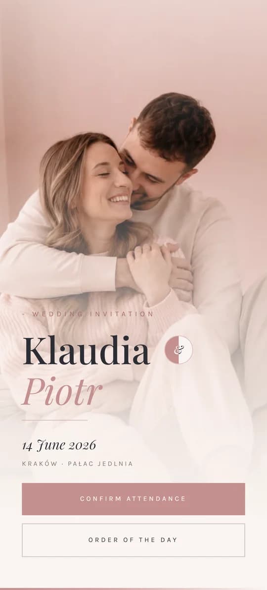
Romantic Softness in Morning Light
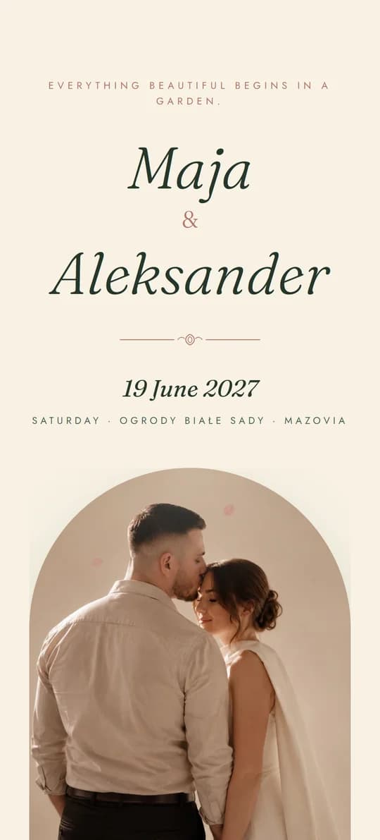
An Invitation in an Envelope, Sealed with Wax
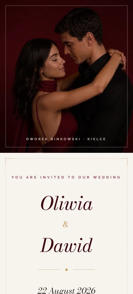
Burgundy Class and Gold Details
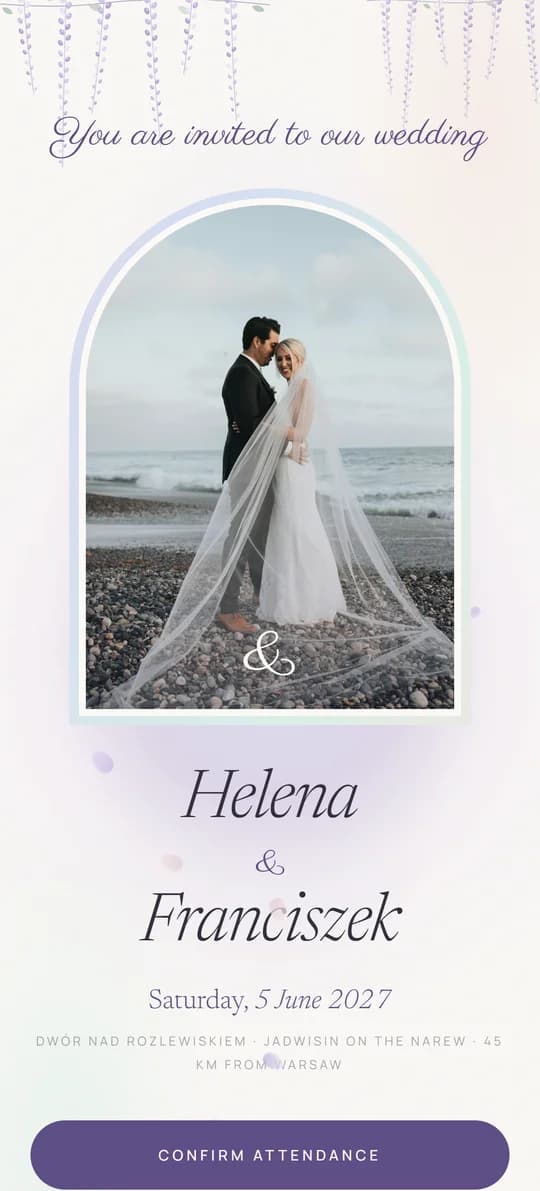
Pearl, Mist and Wisteria - with a Seating Plan
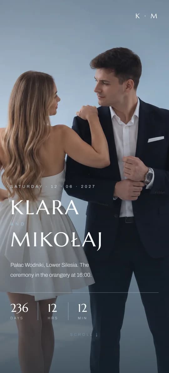
A Silk Ribbon and Cool Blues