Onyx Gold
Black, Paper and Gold, Full of Glamour
Black and White
02 / 11
Black and White, Styled Like a Magazine
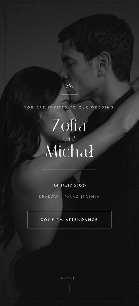
No colour at all - just light, shadow and type. A full-screen black-and-white photo of you two, a menu card like a good restaurant's, and a playlist your guests vote on.
About the theme
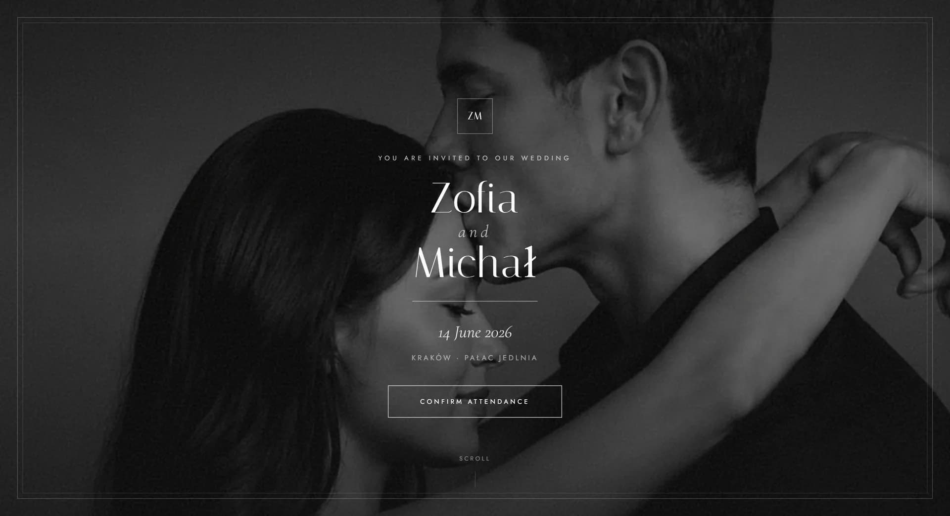
NoirBlanc is for couples who don't want ornament. The whole palette is ink, ivory and white, so the full-screen, desaturated photo of you two takes over, set in a double frame like a photo in a mount. Headings are set in Italiana, body text in a narrow Jost, and an italic Cormorant Garamond only appears where the page softens its tone: the date, a quote, and the thank-you note.
Sections read like magazine spreads - a countdown with digits that roll over every second, the day's timeline written out on black line by line, a menu card with four courses, two hand-drawn direction maps kept in the style of the whole page, RSVP with a dietary and accommodation question, a note asking for envelopes instead of flowers, a shared gallery with a full-screen view, and a playlist where every vote reorders the songs straight away. Everything is made for phones first, and the animations settle down for anyone who has them turned off in their settings.
If you have one really good shoot, this is the theme that gets the most out of it. Nothing here drowns it out.
Who it suits
It's a good fit if
Consider another theme if
Colours and fonts
Ink
#111111
Dark bands and type. A shade softer than pure black, so it doesn't glare in the evening.
Ivory
#F7F6F4
Background for the content. A paper white instead of a screen white, one shade warmer.
Stone
#E8E6E2
Frames, dividers and card backgrounds. The accent here is a change in brightness, not in colour.
Deep Black
#08080A
Full-screen frames and places where the contrast is meant to be unforgiving.
Headings
Italiana
Italiana gives headings the tone of a magazine cover - tall, narrow, no ornament.
Body text
Jost
Jost is calm and neutral, so it leaves the photography the whole stage.
What's included
Standard package
You get all 24 things on this list in every one of the 11 themes - for a one-off PLN 300, with your own domain and hosting for a year. Choosing a theme is choosing a look, not a scope. The demo shows only some of them - a site with everything at once would be too long to browse comfortably. We put yours together from what you actually need.
And more Room for extra sections and information from you.
Guests from abroad read it in English
Every theme comes with a complete English version at the same price. There is a switch in the corner of the page: one tap and the invitation, the RSVP, the running order and the map are all in English. You send everyone the same link and each guest sees it in their own language.
What you see in this demo
09 items
This is a slice, chosen so the demo can be browsed in a few minutes. Everything on the list above can be switched on in this theme too.
Guide
The first thing a guest sees is you two - desaturated, full screen, in a double frame, like a photo in a mount. There's no colour to pull the eye away, no ornament, no gold trim. What's left is light, shadow and whatever's happening between you in the frame. If you've invested in an engagement shoot, this is where that investment starts to earn its keep: a shot with a clear direction of light gets stronger in black and white than it ever does in colour. Instead of ten photos scattered across the page, you get one that everybody remembers.
Sections fall into place like the pages of a magazine, and read the same way: a heading, a photo, one line of caption. The countdown rolls its digits over every second, the order of the day writes itself out on black line by line, the menu card looks like one from a restaurant with a star to its name, and the direction maps are drawn, not pasted in - so even the practical part belongs to the same world. The result is that a guest scrolls to the end instead of leaving after the first screen, and your wedding reads like an event, not like a meeting with an attachment.
The playlist is the one place where guests add something of their own: they see a dozen or so of your suggestions, throw in their own, and vote, with the list reshuffling as they go. For them it's a small pleasure the week before the wedding and a reason to come back to the page. For you it's a ready-made brief for the DJ, spelled out in black and white with what will actually get people onto the floor. No guessing, no list scribbled together at the last minute. It's one of those features you'd normally pay extra for elsewhere, and here it's included.
Other themes
See the full collection →Black, Paper and Gold, Full of Glamour
Warm Harmony and Rustic Elegance
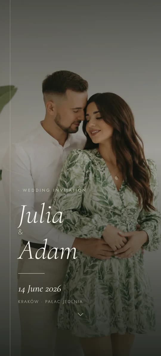
Botanical Freshness and Quiet Order
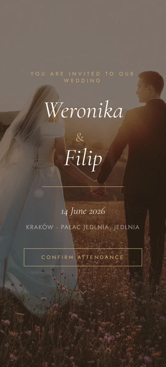
Classic Elegance, Reimagined
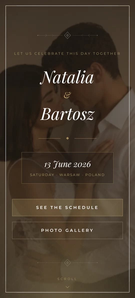
Cinematic Elegance in Warm Tones
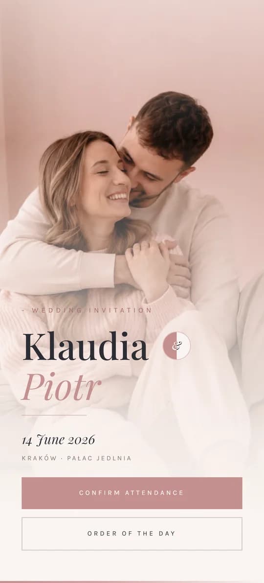
Romantic Softness in Morning Light
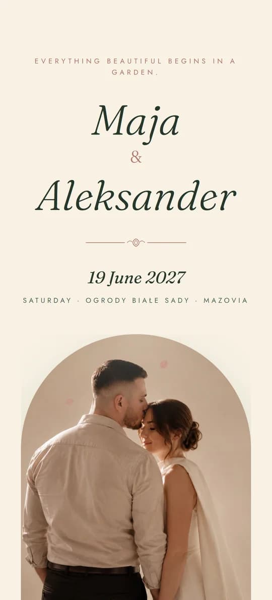
An Invitation in an Envelope, Sealed with Wax
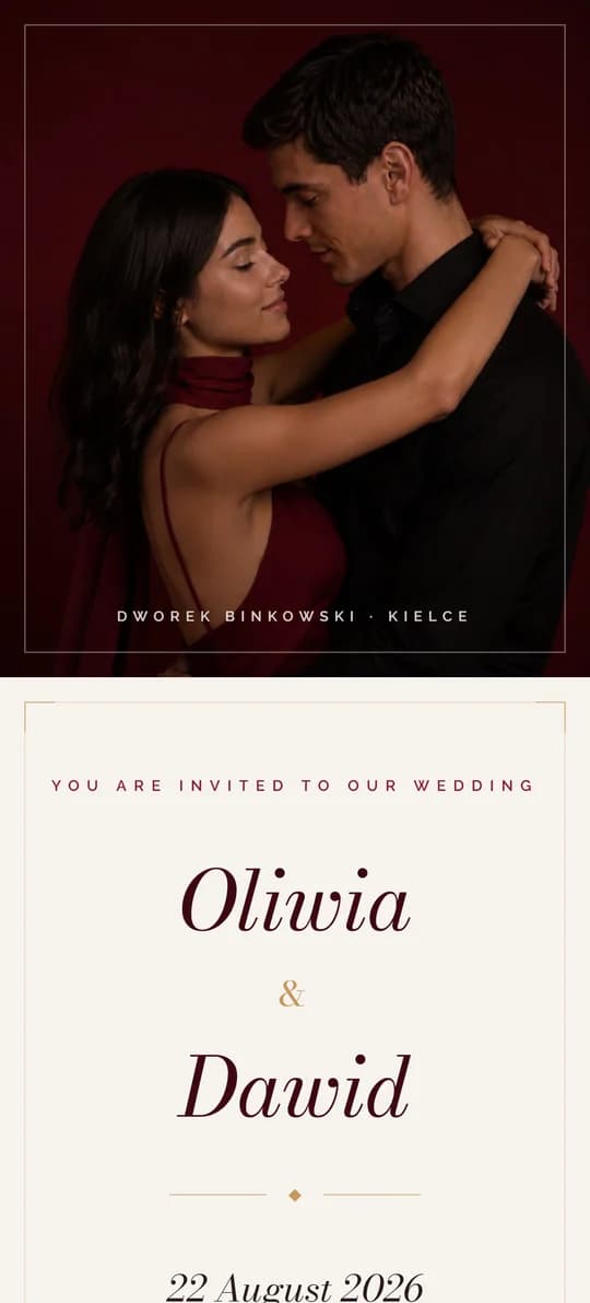
Burgundy Class and Gold Details
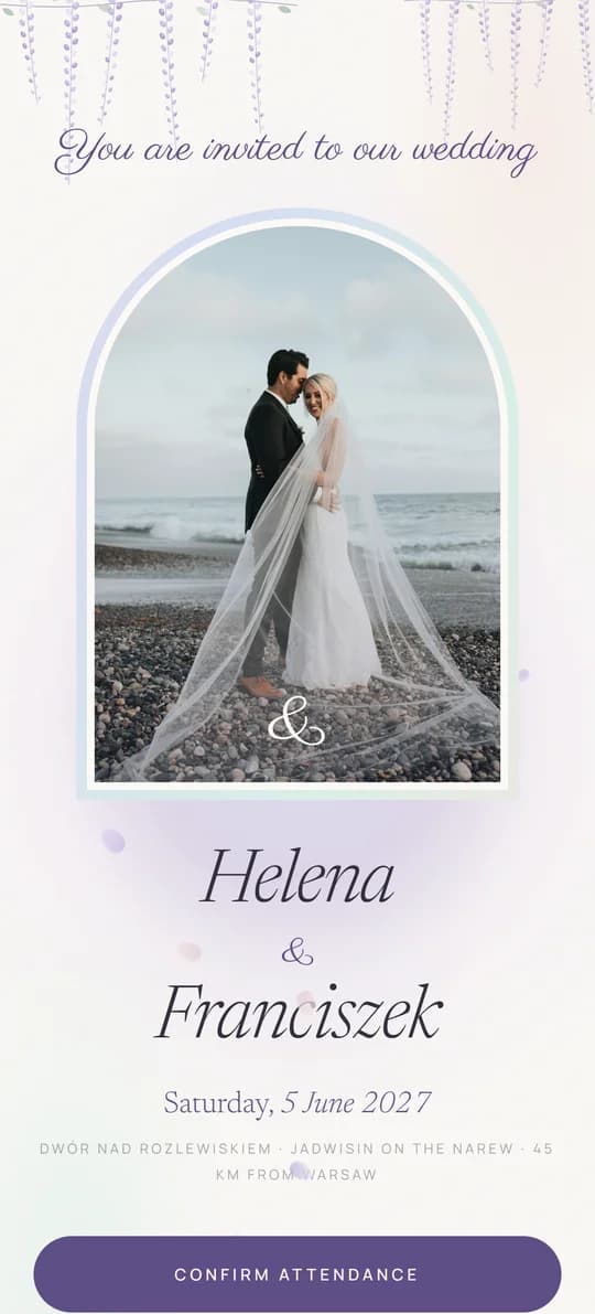
Pearl, Mist and Wisteria - with a Seating Plan
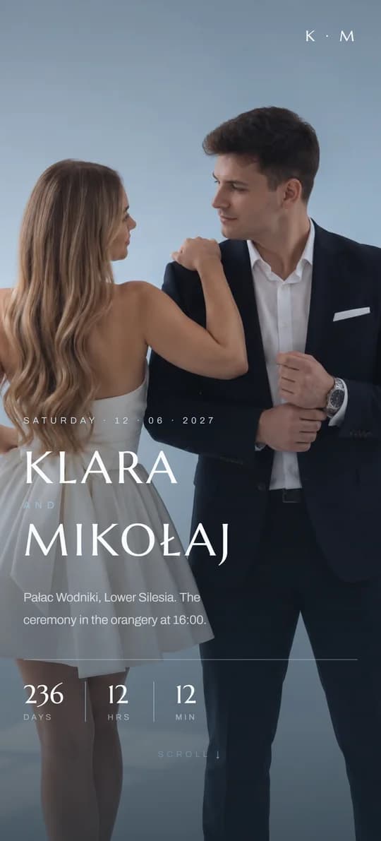
A Silk Ribbon and Cool Blues