Onyx Gold
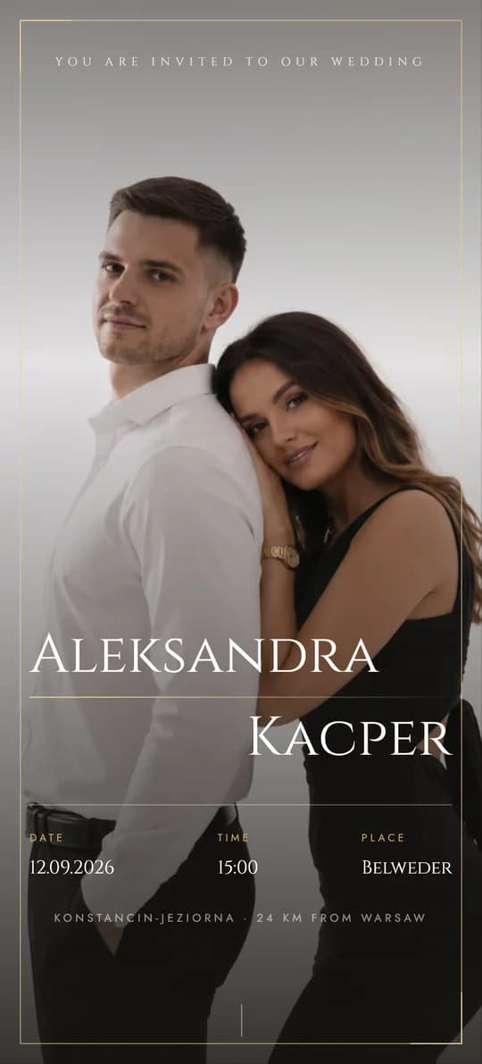
Black, Paper and Gold, Full of Glamour
Light Pink
07 / 11
Romantic Softness in Morning Light
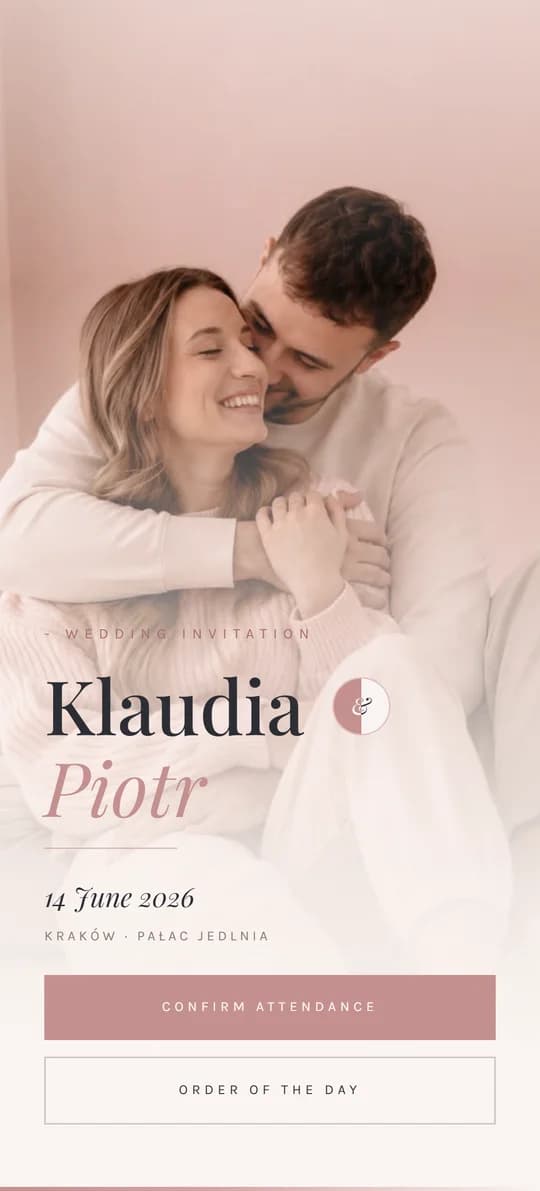
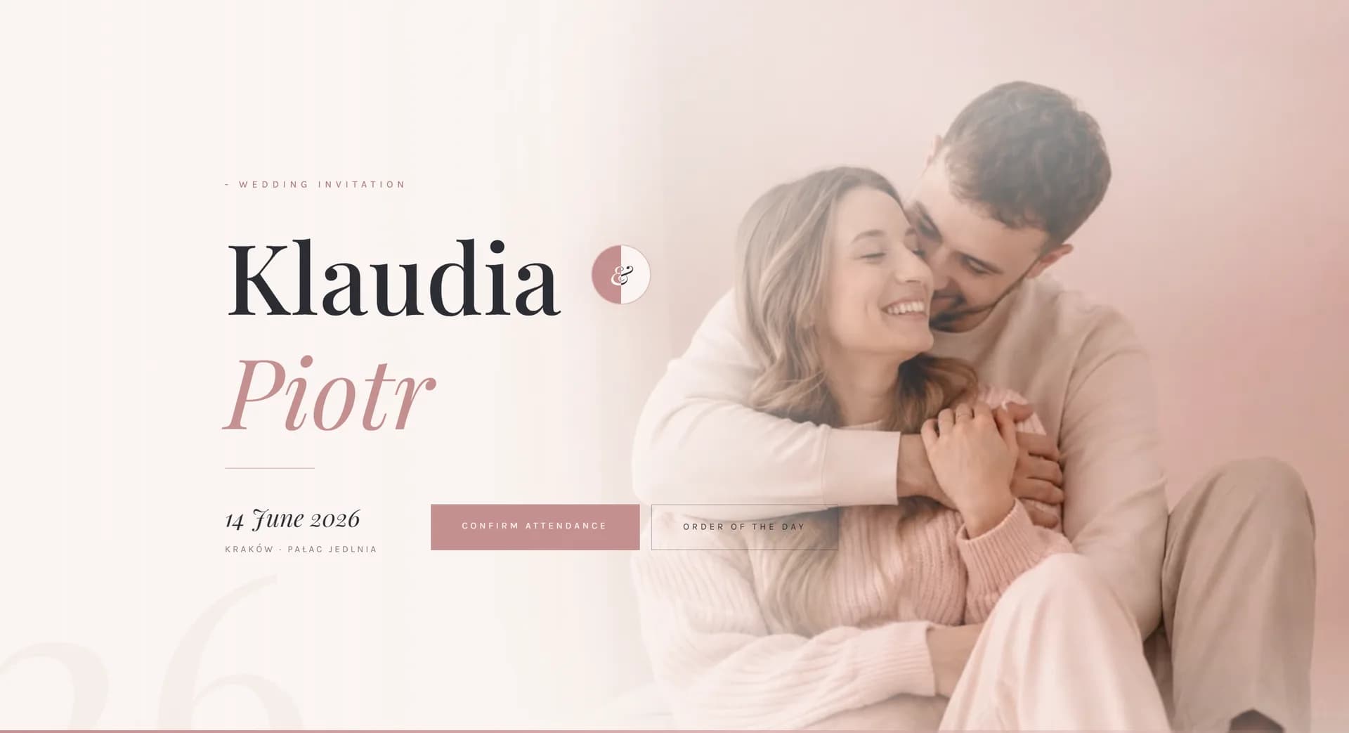
Ivory, powder pink and a softly blurred photo of you two in the background. A light, delicate design for couples who want elegance without heavy, dark colours.
About the theme
DustyRose takes a muted pink and carries it into the light. Your photo blends into the ivory background with a soft glow, and the text breathes on bright panels in three shades of pink - from ivory to a muted powder tone. Playfair Display sets the headings, an italic style softens names and section titles, and Karla keeps the details in order.
Sections read like the spreads of a bright magazine: a countdown in large digits, the day's schedule in two columns, a menu card written out like a restaurant's, two direction maps in cards on a white background, RSVP with a plus-one counter, a note asking for envelopes instead of flowers, a song request playlist, and a shared gallery with guest photos and a full-screen view.
If your photos are bright and delicate, a dark setting would dull them. This one lifts them up.
Who it suits
It's a good fit if
Consider another theme if
Colours and fonts
Ivory
#FAF4F1
Background for the page. The brightest point in the palette, where all the content gets room to breathe.
Powder Blush
#F0DEDD
Section panels. Pink muted just enough that the page never turns saccharine.
Dusty Pink
#C49090
Buttons, lines and active states - the one stronger tone in the design.
Graphite
#2D2D35
Body copy. A cool counterpoint that keeps the bright palette in check.
Headings
Playfair Display
Playfair Display in italics softens names and titles without losing its magazine elegance.
Body text
Karla
Karla keeps the detail in check and never distracts from the bright panels.
What's included
Standard package
You get all 24 things on this list in every one of the 11 themes - for a one-off PLN 300, with your own domain and hosting for a year. Choosing a theme is choosing a look, not a scope. The demo shows only some of them - a site with everything at once would be too long to browse comfortably. We put yours together from what you actually need.
And more Room for extra sections and information from you.
Guests from abroad read it in English
Every theme comes with a complete English version at the same price. There is a switch in the corner of the page: one tap and the invitation, the RSVP, the running order and the map are all in English. You send everyone the same link and each guest sees it in their own language.
What you see in this demo
09 items
This is a slice, chosen so the demo can be browsed in a few minutes. Everything on the list above can be switched on in this theme too.
Guide
Ivory, powder blush and dusty pink - magazine elegance, only lit from within. Your photo blends into the background with a soft glow, the content breathes on bright panels, and italics soften the names and section titles. For a daytime ceremony, in a bright room or outdoors, the page reads like an extension of the photo shoot rather than a contrast to it. If you've already looked at other themes and every one of them felt too dark for your photos, this is the one you were looking for.
You can protect the page with a password if you're publishing private addresses or photos you don't want left online for good. A guest gets the password with the invitation and gets straight in, while the page stays out of search results - your wedding won't turn up in someone's Google search two years from now. Password protection is in the standard package, not a paid add-on. You can also switch it on later, once the reception photos start filling up the gallery.
The form asks about attendance, diet, accommodation and a plus-one, and fields hide themselves when a guest declines, so nobody fills in boxes that don't apply to them - which is exactly why they finish the form. You can cap the number of plus-ones so the guest list doesn't grow on its own; children are better handled as a separate question, since the venue counts them differently anyway. Answers land in your inbox, ready to hand to the caterer. Instead of collecting confirmations across three different chats, you get one list that never falls out of step.
Other themes
See the full collection →Black, Paper and Gold, Full of Glamour
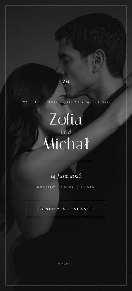
Black and White, Styled Like a Magazine
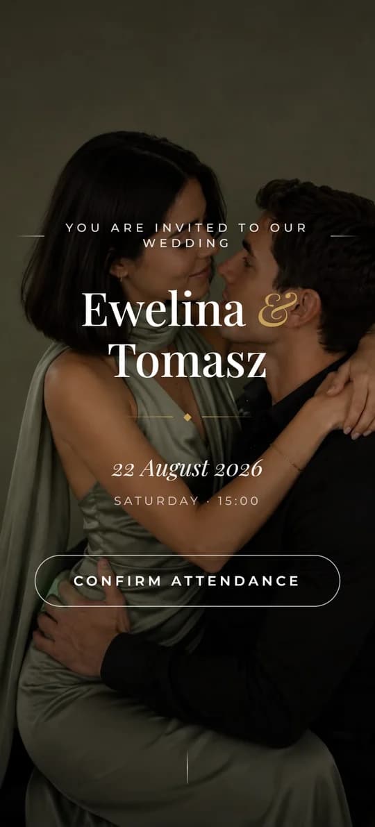
Warm Harmony and Rustic Elegance

Botanical Freshness and Quiet Order
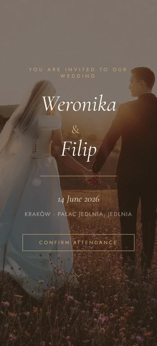
Classic Elegance, Reimagined
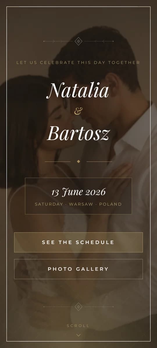
Cinematic Elegance in Warm Tones
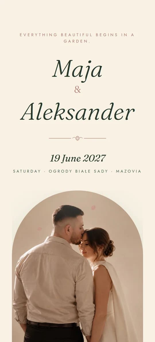
An Invitation in an Envelope, Sealed with Wax
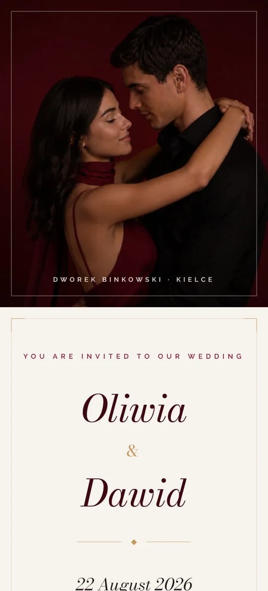
Burgundy Class and Gold Details
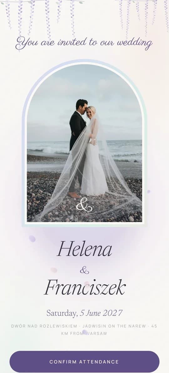
Pearl, Mist and Wisteria - with a Seating Plan
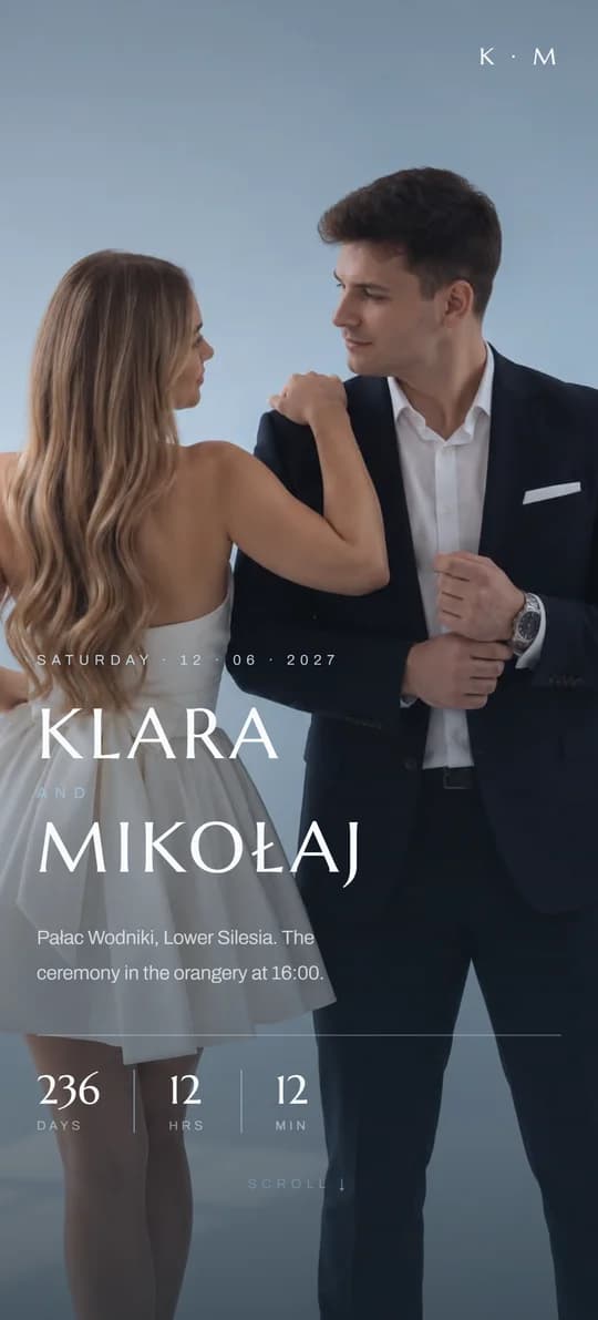
A Silk Ribbon and Cool Blues